What Does a Stock Market Candlestick Chart Mean?
For technical analysts in the stock market, stock charts are an excellent resource. We talked about the many types of charts used by traders in the last article. Let’s get into great detail regarding candlestick charts in this essay.
Describe the Candlestick Chart
A candlestick chart shows how the price of a stock has changed over a specific period of time. Because they are simple to read and understand, this style of the chart is highly common among traders.
What Makes a Candlestick Up?
A candlestick presents a variety of facts in an easy way. A body and wicks make up each candlestick (thin lines extending above and below the body).
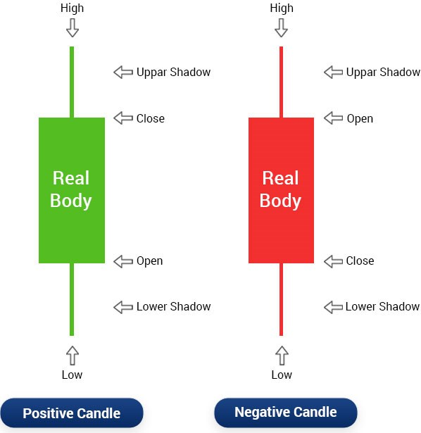
- When the close is greater than the open, a white (or green) candlestick is created.
- If the close is lower than the open, a black (or red) candlestick is created.
- The “actual body” is represented as the region between the open and closure points.
- Wicks or shadows are the tiny lines that emanate from the top and bottom.
- The “high” is represented by the top of the upper wick.
- The ‘low’ is represented by the bottom of the lower wick.
How are Candlestick charts read?
The open, close, high, and low prices of a stock over a given period of time are shown on a candlestick chart. The trader has the option of setting this time frame to suit his needs. For instance, if the time limit is set at ten minutes, the graph will update every ten minutes with a new candlestick. The trader may therefore determine all four of the stock’s significant price movements for a given time frame by merely looking at the chart.
Patterns Found in a Candlestick Chart
Candlestick chart patterns let you gauge the mood of the market and comprehend how supply and demand, greed and fear, etc. are related. Bullish and bearish candlestick patterns are the two main categories. Learn more about them now.
Hammer Pattern
The candle in the hammer candlestick chart pattern has a short body and a long lower wick. The hammer pattern shows that prices have been driven higher by a robust spike despite selling pressure. If you locate more green candles than red candles, the bull market is stronger.
Inverse Hammer Pattern
There are candles with a short body and a lengthy upper wick in this candlestick chart pattern. An initial buying pattern is followed by an initial selling pattern, according to the Inverse Hammer pattern.
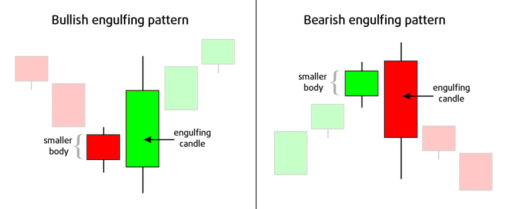
Bullish Engulfing Pattern
Despite opening lower than the day before, the Bullish Engulfing candle chart pattern shows a bullish market driving prices higher. The initial candle in this style of candlestick graph is a short red candle that is completely engulfed by a tall green flame.
Piercing Line Pattern
A long red candle is followed by a long green candle in this particular style of a candlestick chart. It should be noted that the green candle’s closing price is higher than the initial red candle’s body price in this instance, signaling significant purchasing pressure.
Three White Soldiers Pattern
Typically, this candlestick chart pattern is seen following a decline or during a period of price consolidation. A strong bull trend is indicated by the three green candles that start and close higher than the previous day.
Hanging Man Pattern
The candle in this style of candlestick chart has a brief body and a protracted lower wick. It’s a sign that selling pressure outweighed purchasing pressure and that bears are gradually taking control.
Shooting Star Pattern
The candle in this candlestick diagram has a short body and a long higher wick. It’s a sign that the market is being taken over by selling pressure.
Bearish Engulfing Pattern
The initial candle in this candlestick chart pattern is a brief green candle that is completely engulfed by a long green candle. It’s a sign of the slowdown in the market.
Evening Star Pattern
This candlestick trading chart features a short-bodied candle sandwiched between long red and lengthy green candles. Because the short and long candles don’t intersect, an upward trend is being reversed.
Three Blacks Crows Pattern
Three successive red candles with short wicks that open and close lower than the previous day make up this candle chart pattern. This candlestick chart predicts an imminent, significant bear market.
Analysis of Candlestick charts
Candlesticks shouldn’t be viewed in isolation, which is crucial. When it comes to candlestick analysis, the context (previous patterns) is absolutely essential. The trader must look at earlier candlesticks and note any changes over time. Has the candlestick’s body changed in size? Where are the wicks? (shadows). How do they differ now? The trader must ask himself these queries when he examines the candlestick chart.
This is so that it is clear that momentum has increased when the candlestick’s actual body grows larger. The candle’s body displays how much the stock price has fluctuated throughout the time span. Long white candlesticks indicate market strength that is bullish, whereas long black candlesticks indicate market strength that is bearish.
Spinning tops
The bodies can occasionally be very short and the shadows can be very huge. This has a spinning-top-like appearance. A figure like this suggests that there wasn’t much movement from the opening price to the closing price. But throughout that time, there was a dramatic change in the stock’s price. It suggests considerable volatility.
Conclusion
Candlestick charts have a lot to say about the mood of the market. To track the market, this shouldn’t be the sole method, it’s crucial to keep in mind. To better understand market movement and investor emotion, many traders combine different technical analysis tools.
FAQ
What can you infer from candlestick charts?
Traders utilize candlestick charts to predict potential price movement based on historical trends. When trading, candlesticks are helpful since they display four price points (open, close, high, and low) over the specified time period.
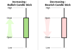
How may a bullish or bearish candle be identified?
The image above shows two common candlesticks: Bullish Candle, which occurs when the close is higher than the open and is typically green or white, and Bearish Candle, which occurs when the close is lower than the open (usually red or black)
Which candlestick pattern is the most potent?
Doji. The Doji, one of the most significant single candlestick patterns, can provide you with information about the mood of the market. When a stock’s opening price and closing price are the same, dogs are said to form.
Which candlestick pattern can be trusted the most?
One of the most potent candlestick patterns is the engulfing pattern, which consists of two candles. It happens when the second candle, the most recent candle, totally obscures or engulfs the first candle.
A bullish candlestick, what is that?
A bullish candle pattern alerts traders to the market’s impending upswing following a price decline. This reversal pattern indicates that bulls are taking control of the market and may potentially drive prices much higher, signaling the ideal opportunity to initiate a long position.
Read more: The Top 11 Stock Chart Patterns
7 Chart patterns that use to purchase stocks.
A Candlestick Pattern: What Is It?